Creating a serene and peaceful atmosphere in your home starts with the right color palette. Calm colors can reduce stress, promote relaxation, and make your living spaces feel more welcoming. Whether you’re repainting a single room or redecorating your entire home, choosing these colors thoughtfully can transform your environment into a restful haven.
In this post, we’ll explore practical tips to help you select calm colors that suit your style and space perfectly.
Why Choose Calm Colors?
Before diving into the how-to, it’s helpful to understand why calm colors are so effective:
– Promote Relaxation: Soft hues can soothe your mind and body.
– Enhance Focus: Calm colors reduce distractions, ideal for work or study areas.
– Create Balance: These colors often blend well with natural elements like wood and plants.
– Increase Home Value: Neutral and peaceful color schemes appeal broadly, making homes more inviting.
Understanding Color Psychology
Colors have subtle effects on mood. Here are some calming shades and their typical influences:
– Blue: Often linked to tranquility and stability; perfect for bedrooms or bathrooms.
– Green: Symbolizes nature and renewal; great for living rooms or any space needing freshness.
– Lavender and Soft Purples: Promote peace and restfulness.
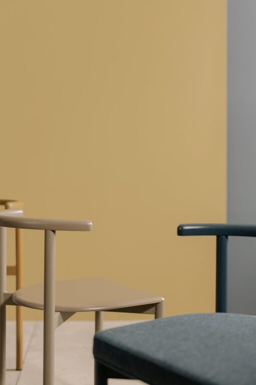
– Beige and Taupe: Offer warmth without overwhelming the senses.
– Soft Gray: Neutral and grounding, ideal for modern, minimalist styles.
Keep in mind, the right shade and tone are important—too dark or overly bright versions can feel less calming.
Tips for Choosing Calm Colors
1. Consider the Room’s Purpose
Start by thinking about each room’s main use:
– Bedrooms: Prioritize soft blues, greens, and lavenders to encourage restful sleep.
– Living Rooms: Balanced neutrals paired with muted blues or greens create comfort.
– Home Offices: Light gray or gentle green help maintain focus and reduce eye strain.
– Bathrooms: Light blues and aquas evoke cleanliness and calm.
2. Test Colors in Different Lights
Natural and artificial light changes how a color looks. Take these steps:
– Paint Samples: Apply test patches on walls to see colors at different times.
– Observe: Notice how morning sunlight, midday brightness, and evening lamps alter the shade.
– Adjust: If a color feels too cold or warm in certain light, consider subtle tint adjustments.
3. Use a Monochromatic Palette
Opting for one color in varying shades is a simple way to maintain calm without dullness:
– Depth and Interest: Use light, medium, and darker tones to create layers.
– Easy Coordination: Furniture and decor match easily with a single hue range.
– Visual Flow: Monochromatic schemes make spaces feel cohesive and peaceful.
4. Incorporate Natural Elements
Colors inspired by nature tend to feel more calming:
– Earth Tones: Browns, soft greens, and muted ochres work well with indoor plants and wooden furniture.
– Textures: Combine calm colors with natural textures such as linen, cotton, or wood grain for soothing effects.
5. Balance Warm and Cool Tones
Even calm colors have underlying warmth or coolness:
– Warm Colors: Beige, soft peach, or warm taupe add coziness.
– Cool Colors: Blue, gray, or green offer freshness and calmness.
Try mixing warm and cool undertones in your palette for balanced energy.
6. Limit Bright or Intense Shades
Avoid colors that can be too stimulating in spaces meant for relaxation:
– Bright Reds or Oranges: Generally too energizing for restful rooms.
– Neon or Saturated Colors: Can create tension and distraction.
If you love vibrant colors, use them sparingly in accents like pillows or artwork.
7. Use White and Off-White Wisely
White can refresh a room and highlight calm colors:
– Off-White: Softer and warmer than pure white, it’s easier on the eyes.
– Trim and Ceilings: White can brighten a space and create clean lines.
– Contrast: Calm colors pair well with white for a crisp, airy feel.
How to Bring Calm Colors into Your Home
Paint Walls
Choosing one or two calm colors for your walls sets the tone.
Decor and Accessories
Add calm shades through:
– Curtains
– Throw blankets and pillows
– Rugs
– Artwork
Furniture Choices
Neutral-colored furniture complements calm walls and provides a balanced look.
Lighting
Warm, soft lighting enhances calm colors and deepens their soothing effect.
Final Thoughts
Choosing calm colors for your home is a personal and enjoyable process. Think about how each color makes you feel, experiment with samples, and remember that your home should be your sanctuary. Calm color choices are a great starting point to creating a space that welcomes relaxation and harmony every day.
By applying these tips, you’ll design a peaceful environment that supports your well-being and invites comfort for everyone who visits. Happy decorating!